WIND
WIND PRODUCT & BRAND DEVELOPMENT
Law Firm Technology
WindLegal.com
Challenge
Our client E-Stet hit a creative wall developing an app that would help small law firms compete against large ones by automating billing and complex litigation data. The company had a team of disparate departments voicing a cacophony of ideas about what the technology should do, how it should look, and why it was important. Our challenge was to bring all the elements into focus and create a unified product and brand which spoke to small law firms and their pain points.
Wind Story & Styleguide


Solution
Why?
It’s a question we ask ourselves a lot in the branding and marketing world, but sometimes we need to ask it more than once to get to the answer we’re looking for.
With so many different opinions out to define E-Stet’s latest software, we started by getting all the major stakeholders in one room and asking this question: Why?
With each subsequent iteration of this question we managed to get closer to the root of the technology and uncover its emotional driver: People become lawyers to seek justice, and technology empowers their mission.
Upon deciphering this core brand message, we held a series of Blue Ocean and Strategy Canvas sessions, allowing a collaborative environment for leaders from engineering, operations, financing, and management departments to iron out their ideas and define a clear positioning statement
During the sessions the group settled upon the naming the technology Wind, since it is a force that helps power litigation strategy.
Running a competitive analysis we found the name was surprisingly available in the tech space and flew in the face (pun intended!) of the similar technological litigation nomenclature.
Riffing off the name we created evocative imagery for the brand, showing epic photos of wind blowing over mountains, grand landscapes of wind farms, and choppy seas. The brand’s design, language, and personality quickly followed suit.
For the logo we abstracted a symbolic codex from the name Wind, using an undulating design that creates movement but is still recognizable with the tittle over the “i”. We then reinforced this by animating the logo with a swirling effect and punctuating it with a sonic identity of wind chimes over a modernist technobeat to create energy.
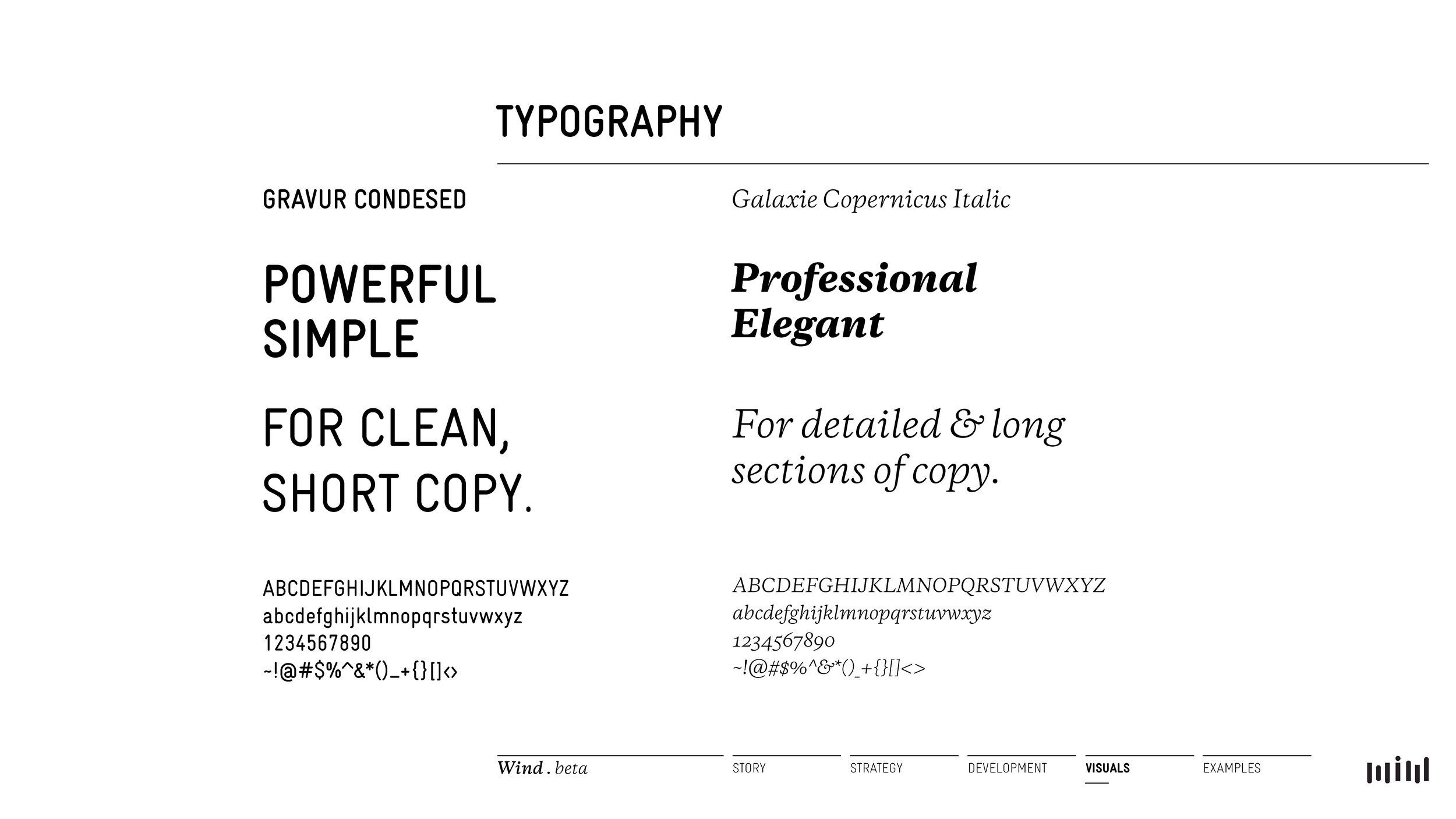
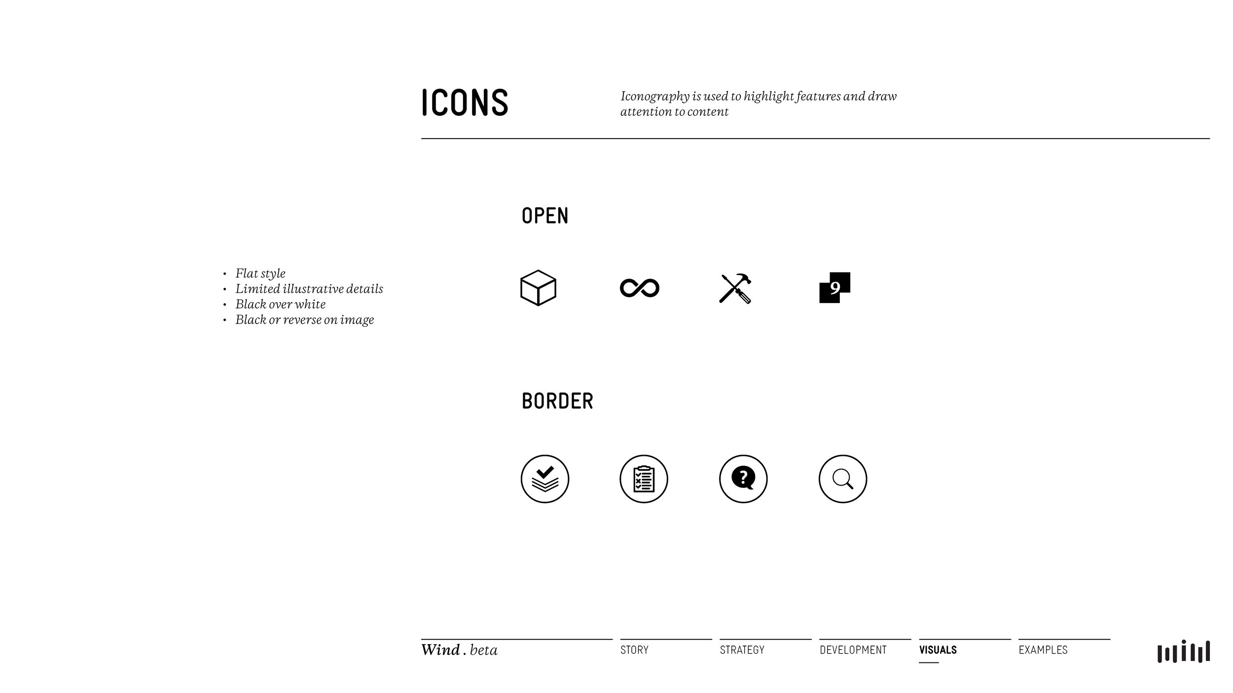
Staying consistent with this aesthetic we worked with a team of engineers to create a Graphic User Interface (GUI) that was clean and made use of open space, feeling more like a magazine or legal ledger rather than the contemporary best practices of similar technology, which consisted of bubbly interfaces inundated by extraneous data.
In addition to this sharp positioning contrast, we made use of the color purple for the brand, since it is most closely associated with power and stood out from the competition, which was mostly greens and blues.
Wind was built to be self-running — a powerful automatic software for law firms that didn’t have the budget of multinational ones — so we created media to support this goal. Among these assets were digital onboarding documents and videos to help members understand the technology.
At the end of the day, the core driver for Wind was all about justice. Justice for the small law firms that needed to go up against the Goliaths. Justice for the plaintiffs that depended upon affordable legal help; and ultimately, justice, for a brand that was able to succinctly package the powerful services it had to offer.
Services
Meaning
Competitive Positioning
Brand Audit
Team Collaborative Sessions
Strategy
Product Development
Vision
Name
Visual System
Logo
Experience
App UX / UI
Website
Mobile Optimization
Multimedia Content (Words & Images)
Animated & Sonic Identity
Introductory Video
Music
Social Media
Growth
SEO
Site Mapping
User Metrics
Web Measurements & Analytics
Some Projects From OUR OTHER FRIENDS