ByFusion
BYFUSION BRAND DEVELOPMENT & MARCOM
Transforming Plastic Waste into Sustainable Building Solutions
ByFusion.com
Challenge
ByFusion is on a mission to save the world. When we started with the B-corp, it was just finishing development of a ground breaking technology that reshapes 100% of plastic waste into an advanced building material. Pivotal investor meetings loomed on the horizon and in a few months the company was aiming to embark on a global campaign that would bring its machines and plastic blocks to market.
ByFusion had the product to solve earth’s plastic crisis, it had the charismatic leadership that could get the job done, and it had the eager audience waiting for it to officially launch — now all it needed was the iconic brand to help it succeed.
BYFUSION STORY DECK


The Solution
A brand isn’t fabricated from thin air, but must sprout organically from the fundamental ideological seeds of what a company stands for.
In the case of ByFusion, it wasn’t that the company had too little to say, but that it was trying to say too much, obfuscating its core message with inconsistent imagery, design, and language.
Our first task was to audit the company’s existing materials, exposing some missed opportunities it had to optimize its message. Changes ranged from a new font and refurbished logo, to a more cohesive language architecture calibrating everything from the company’s overarching beliefs and values down to the names of its sellable products.
TYPOGRAPHY
Typography is one of the most subtle and pervasive forms of a brand’s visual communication and ByFusion lacked a consistent font. After an industry analysis we settled upon GT Pressura for ByFusion, which is a monospaced font that makes letters appear as though they’re under slight pressure. Rather than using similar machine-typefaces such as Courier New or American Typewriter, GTP has a balanced organic touch and softer angles. The subtle curves and monospaced balance of GTP reinforces ByFusion’s technology and products — a machine that creates plastic building blocks for the greater good of humanity. Rather than use different fonts for (what is a font architecture called??) We used different weights and variations of GTP throughout ByFusion’s website, sales materials, investor pitch decks and additional assets, unifying the company’s aesthetic.
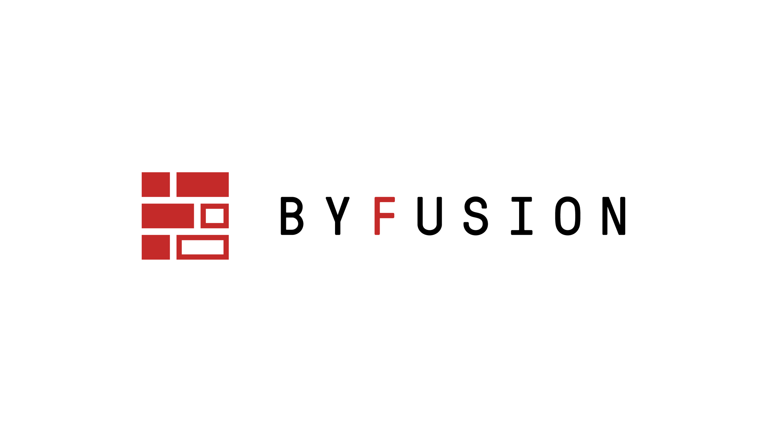
LOGO
ByFusion did not want to change its logo too much as it had already used it on some shipping containers and videos. Our goal was to find an economical way to refine what existed without altering it beyond recognition. When deconstructing the logo into its core elements we discovered an opportunity to create a recognizable icon that still maintained its core design traits. Previously the logo had been a mundane red square with randomly drawn blocks inside. By rearranging the blocks into an F shape emphasized with the company’s signature red and balanced by strategically placed white space, we were able to make a impactful shorthand symbol for ByFusion that we used throughout all its social media, ephemera, and other customer touch points.
LANGUAGE
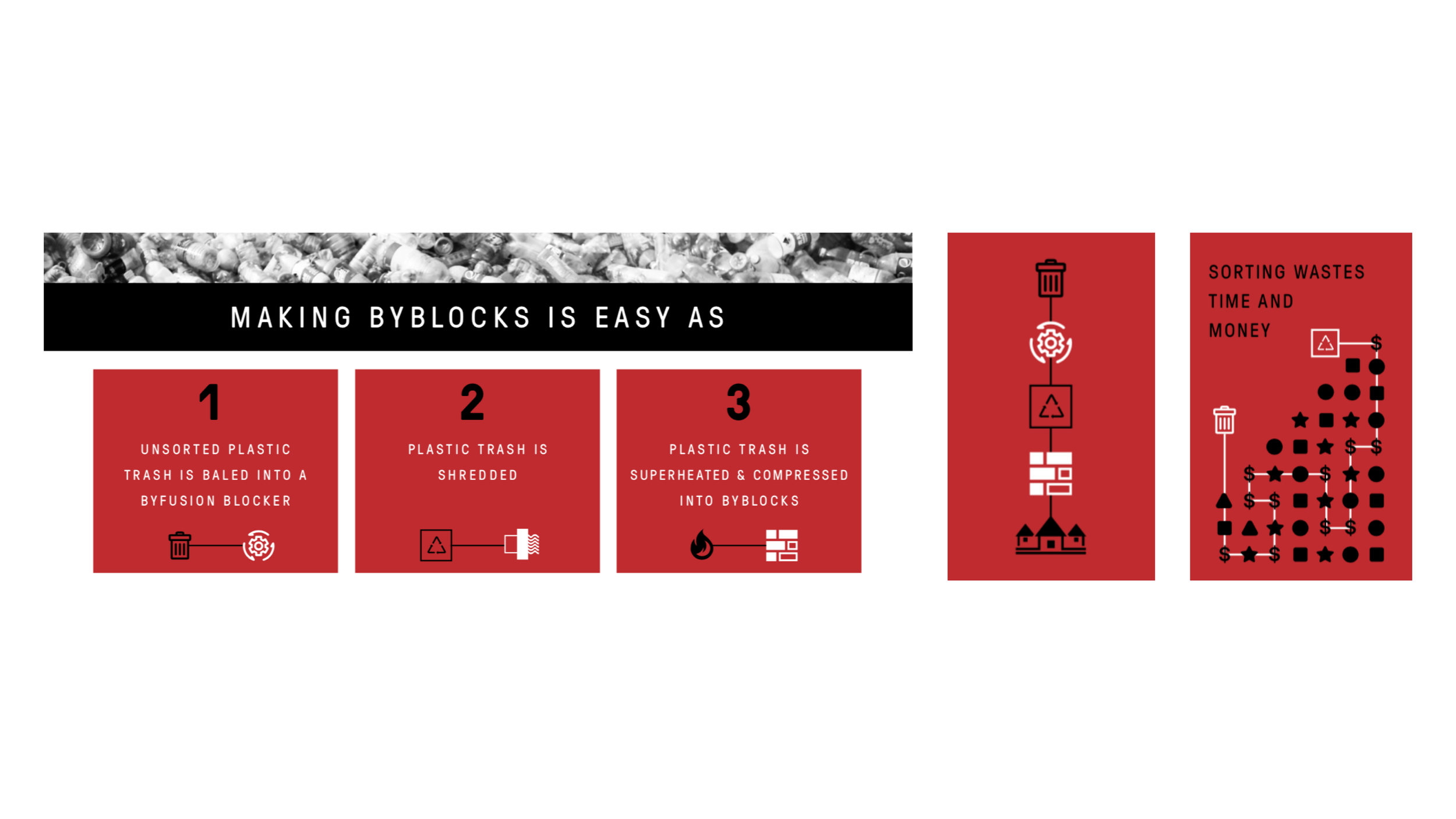
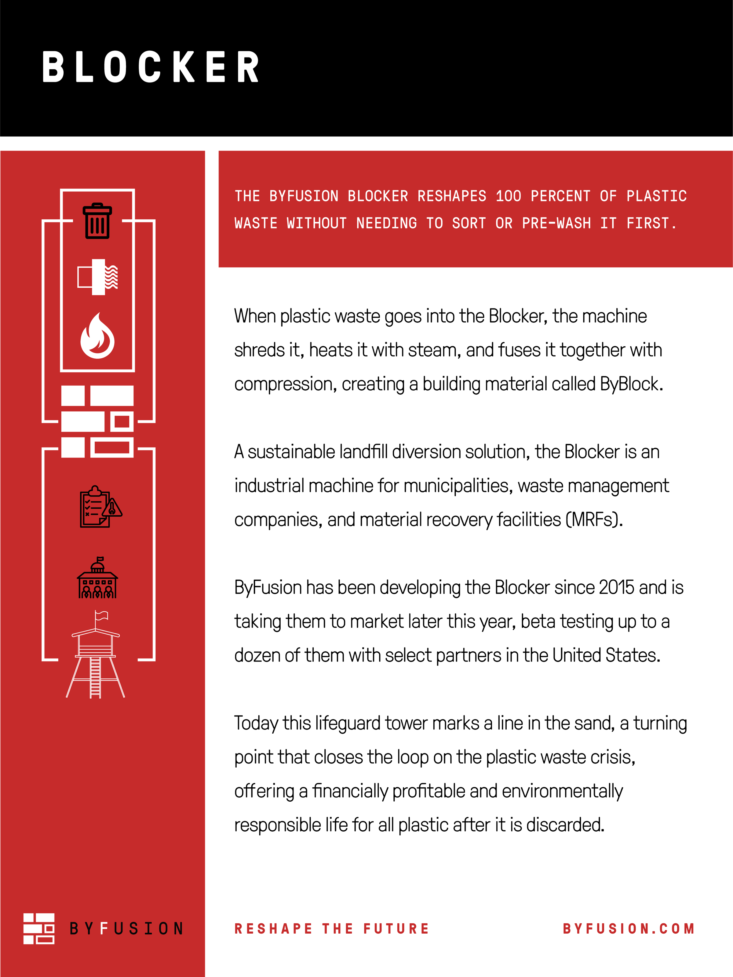
Developing proprietary language and literature for ByFusion began tentatively, as we were originally approached by the company to help it refine an investor pitch deck and sales materials before an upcoming deadline. The core service of the company repurposes 100% of plastic waste into a lego-like building material. Expanding off this idea, we guided ByFusion to rename is Replast Blocks and Machine to include the more memorable naming structure of ByBlocks and Blocker, reinforced by the memorable call to action, “Block Plastic Waste For Good!” The rallying slogan describes how the company stops plastic from entering the environment and molds it into advanced building blocks. Honing the language further, we created a Powerpoint presentation and sales materials for the different audiences ByFusion would be appealing to: the builders using ByBlocks, the municipalities that using the Blocker, and investors that supported the company’s mission.
ALIGNMENT
Encountering success with its initial round of investor meetings ByFusion brought us onboard as its marketing team to build out social media campaigns and additional company assets. An A/B email survey conducted after ByFusion’s investor meetings to gauge audience opinion on the verb “Block” convinced the company to side with one of the less confrontational and more inclusive messages we crafted for it — “Reshape The Future”
The process of uncovering the company’s core philosophies and beliefs included a deeper dive into the brand’s architecture, and produced internal language documents, communications templates, a refurbished website integrated with Hubspot, an annual marketing and advertising roadmap, shirts and engaging media content. The calibrated messaging of the company was built to change the world’s relationship to plastic from viewing it as a disposable piece of trash to a powerful building material, and sewed the seeds for ByFusion’s iconic brand to succeed with its mission of reshaping the future of plastic and the world.
EPHEMERA
VISUAL LANGUAGE
World Ocean’s Day Campaign


Services
Meaning
Competitive Positioning
Brand Audit
Team Collaborative Sessions
Strategy
Product Development
Vision
Visual System
Logo
Experience
Website
Mobile Optimization
Multimedia Content (Words & Images)
Animated Identity
Social Media
Presentation Design
Ephemera
Growth
SEO
Site Mapping
Project Management
Some Projects From OUR OTHER FRIENDS