MedTech Solutions

Logo Before & After
MEDTECH SOLUTIONS REBRAND & WEBSITE
HealthCare IT Services
MedTechSolutions.com
Challenge
MedTech Solutions is a cloud hosting company that works exclusively with healthcare organizations across the United States. The company had an outdated website and wanted to synthesize the melange of web content it had accrued over the years into a clear and compelling sales platform that was easy for prospective clients to navigate.
Brand Architecture & Naming for Service Packages
Solution
After conducting a competitive analysis and reviewing MedTech Solution’s existing content, the project scope for building its website expanded into a nimble rebranding campaign.
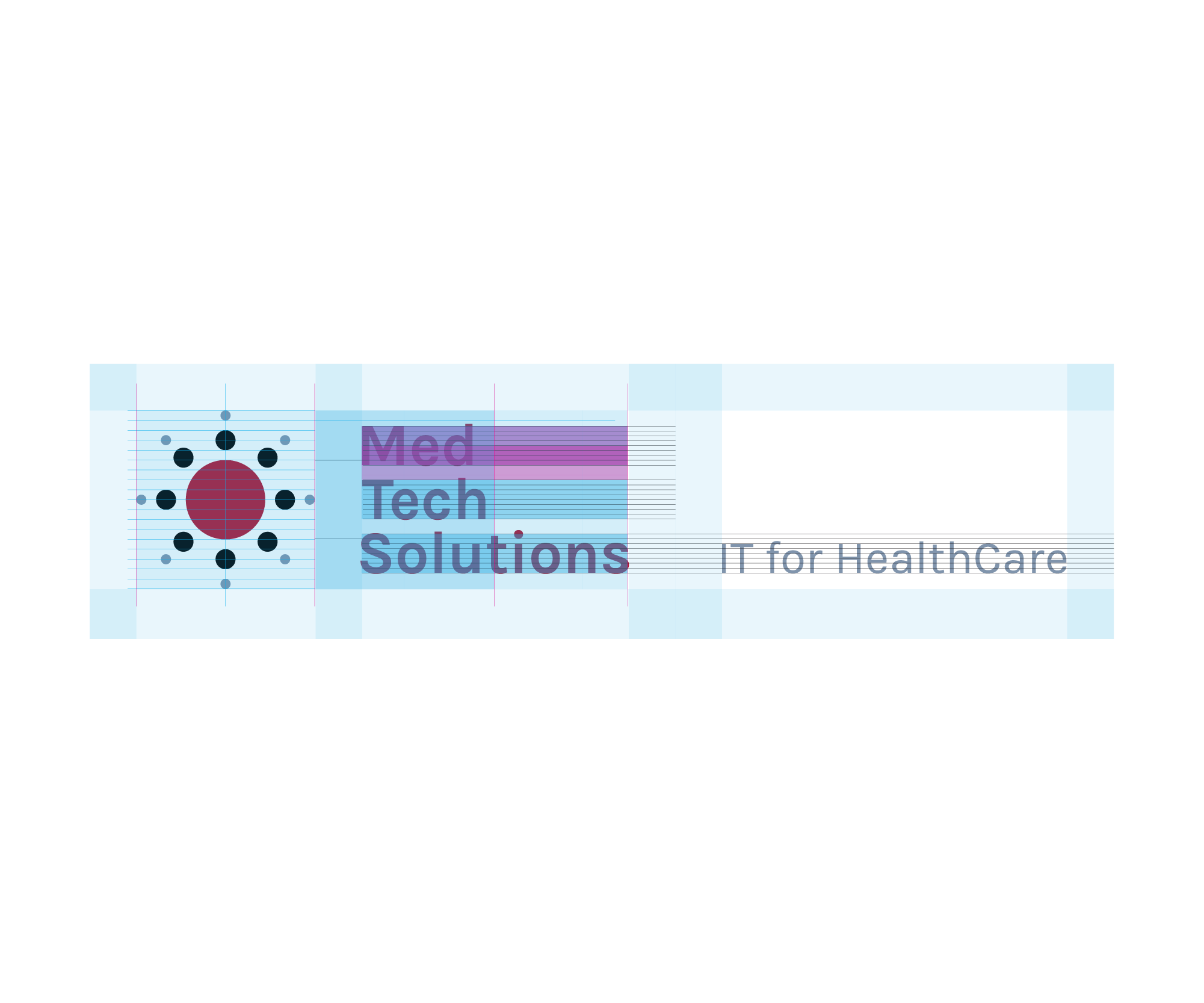
We simplified its goulash of information and services into the digestible slogan, “IT for Healthcare” and created an infrastructure off this core message.
First to change was the company’s name. Its previous name, MTShealthcare, was vague and did nothing to denote what sort of healthcare services it offered. We quickly discovered the MTS acronym stood for Medical Technical Solutions which, while more descriptive, was a mouthful. Instead we suggested the MedTech Solutions, which satisfied our client’s requirements for description and brevity.
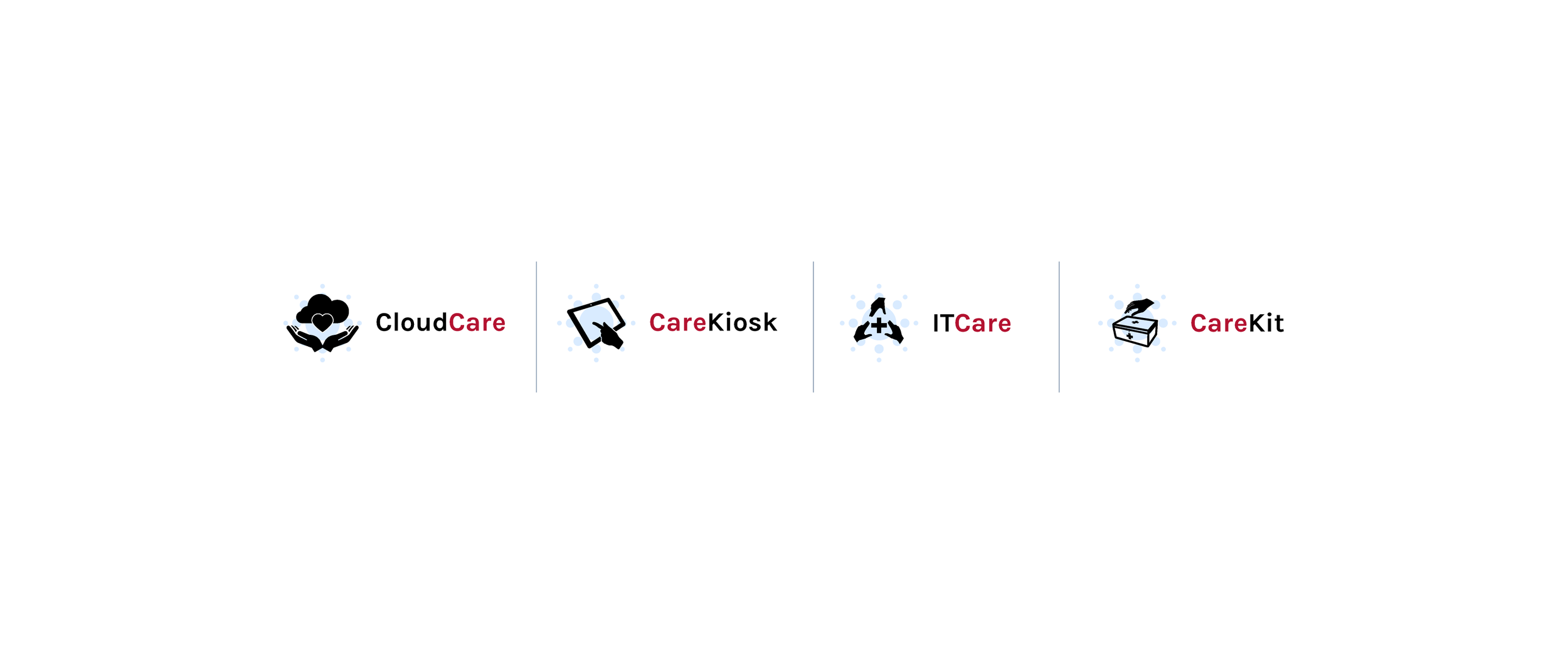
Expanding off the “Solutions” in the company’s name, we packaged its services into a suite of four categories. “Care” was used as either a prefix or suffix in each category, creating a name architecture that unified its business solutions and reinforced the slogan "IT for healthcare."
To visually identify and differentiate each service we created icons, which expanded further upon the “Care” theme by including hands in all of the graphics.
A consistent color scheme of white, light grey, bright blue and accents of bright red, preserved the company’s original colors. By subtly rearranging the color hierarchy to use less light grey and more red, we made its sale messages easier to read and emphasized the Call to Action items on each page.
Keeping form with the theme of reducing clutter and promoting a unity of technology and healthcare, we modified the company’s logo and typeface, as well.
For the logo, we flattened the previous design to a 2D plane making it more scalable and visually appealing across multimedia platforms. We simplified the sun formation to make it less busy, reinforcing the company’s core themes of simplicity and care.
Likewise, we chose the contemporary typeface Karla, which has unique characteristics to each letter, making it feel engineered yet human at the same time.
We worked closely with an engineer to develop the site on the backend platform of the company’s choosing, receiving overwhelmingly positive feedback upon its launch.
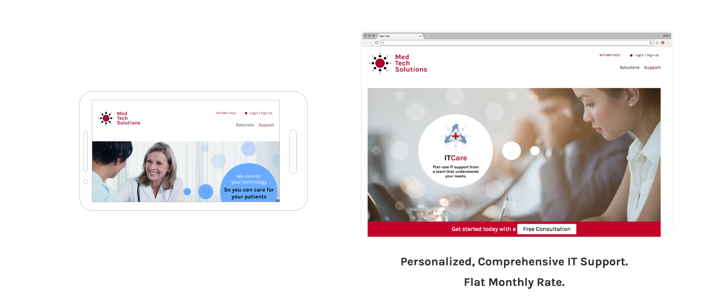
MedTechSolutions.com Website Experience
Services
Meaning
Competitive Positioning
Brand Audit
Demographic & Cultural Studies
Name
Logo
Visual System
Archetypes
Vision
Mission
Belief
Experience
Website
Mobile Optimization
Multimedia Content (Words & Images)
Sales Sheets
Press Kit
Print Communications
Trade Booth
Growth
SEO
Site Mapping
User Metrics
Web Measurements & Analytics
Logo Architecture
"
IT's day & night from where we were & where we are now.
Friends created new content around our products & services, ultimately rebranding Med Tech Solutions as part of a new strategy.
Our customers have complimented us on the simplified look & feel.
"
Gary Jacobs, Director of Marketing
Some Projects From OUR OTHER FRIENDS